How to properly interpret raw data into meaningful information.

Background
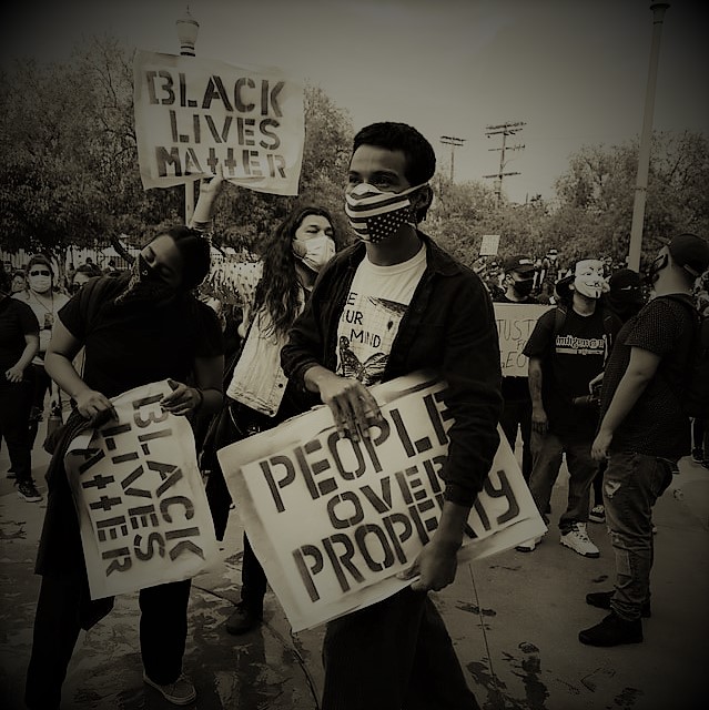
The unjust killing of George Floyd has sparked a national outcry, more so than any other instance of police brutality in recent history. Economic uncertainty, paired with the disdain for the current administration’s lack of leadership, seemed to trigger a much more heated response. Add in the fact that a sizable number of US residents were following quarantine orders, thus given more opportunities to observe current events, and you have the perfect storm for the country to finally acknowledge a reality that has, for far too long, been swept under a rug.
With any sociopolitical movement, there are always those who opt with the opposite side or focus on the secondary aspects, detracting from the original conversation. Often, this is an unintended consequence of a variety of social, economic, political, and educational factors. Today, I will focus on the latter aspect: the educational.
For as long as I can remember, whenever I’ve been asked: “What is the one thing every child should know before graduating high school,” I’ve always held that a solid grasp of statistics and research methods was vital. Sure, personal finance, taxes, and a variety of other life skills are also necessary; however, the ability to analyze and interpret data to draw meaningful conclusions extends into the daily frameworks of our life.
Diving into the data
Take, for example, the current situation in the US regarding protesters and opportunistic rioters and looters who follow. A sizable portion of the population is focused on the riots and looting, and only passively acknowledge the unjust killing of George Floyd. Furthermore, these individuals often do not fully recognize the larger problem of police brutality, particularly against Black Americans.
When confronted with the issue, they may share raw data, which they believe justifies their position. Often, these individuals will share a data set similar to the one below.

Note: “White” indicates Non-Hispanic White.
The data from the chart above is meaningful only if we care to look at absolute numbers. It shows the total number of individuals within a select category of racial backgrounds who were fatally shot by law enforcement officers between 2017 and 2019. Note that this data is specific to fatal shootings and not all uses of force that resulted in a fatality. We are using this data because it is more accessible and easier to discern.
Absolute numbers like these are rarely, if ever, used alone to draw definitive conclusions. However, that does not stop the amateur “researcher” from taking this data set and concluding that *police kill nearly twice as many White victims as Black victims.* They may even reference another chart, similar to the one seen below.

Note: “White” indicates Non-Hispanic White.
Charts like the above are particularly deceptive because they have been manipulated to favor a particular narrative. This chart takes the data from “Chart 1” and converts it into relative percentages. While it is not inherently deceptive to convert data in this way (you will see me use this data later on), the FBI posts raw numbers not for the public to draw absolute conclusions, but for researchers and informed individuals to use the data sets for meaningful research. You will never see a chart like the above posted alone by any official source, because it offers no useful insights independent of context.
Fringe bloggers and media outlets will often create charts like this to push a narrative such as: “More than half of those killed by police were White, where is the outrage for them?” or “Police kill black victims at half the rate of White victims, so clearly this isn’t about race.”
With that said, let’s take a look at an essential chart as it relates to the data above: The population of the US by race.
Omission by ignorance?

This pie chart shows us the racial demographics of the US as it pertains to the three categories in our raw data. We can immediately see that more than half of the US identifies ethnically as “White” and a little over 1/8th as “Black.” This is important data, as it drastically changes the context of the raw numbers we have seen earlier. As a side note, the 60.40% number specifies those who identified as ‘White’ and ‘Not Hispanic or Latino.’
Now, within the context of this discussion, take a look at the chart below.

Data sourced from Chart 3 within the context of Chart 1
Pie Chart 4 is similar to Chart 3, but it connects the population demographics of the US to the sample population within our raw data (Chart 1). In other words, if we were to randomly select only “White,” “Black,” and “Hispanic” individuals from the population, this is what the racial demographics of our data set would be. Each group receives more representation relative to their overall size, since we have omitted roughly 8% of the population in our initial data set.
You may be wondering why I chose to portray the data in this way. Realistically, it would not have made a drastic difference either way, since these three groups make up more than 90% of the population. It is crucial, however, to keep the data consistent with our original raw data, so that we can accurately track the relationships between race, population demographics, and the relative disparities within our findings.
If we want to determine whether a racial bias exists within fatal shootings by law enforcement, particularly between Black and White individuals, we need to interpret both the raw numbers and the relative population demographics. So, let’s interpret the data.
Interpreting what we have so far
We know that based on the previous data:
-
- White individuals make up:
- 60.4% of the US population.
- 65.6% of the sample population.
- 51.6% of those killed from the sample population.
- Black individuals make up:
- 13.4% of the US population.
- 14.5% of the sample population.
- 28% of those killed from the sample population.
- White individuals make up:
If you know what to look for, you will already see a disparity in the numbers above. If not, let’s dive a little deeper.
Take a look at each set of bullets ii and iii. Notice how in each set, they are significantly different from one another. Suppose, in this case, that absolutely no racial bias existed, and the likelihood of being fatally shot by law enforcement was indeed a random event. We would expect bullets ii and iii to be very similar, portraying that the possibility of being fatally shot was no different than the racial demographics of the sample population. This is what is “expected,” in a sense.
Let’s think of this another way…
Suppose you have a bowl of green and blue M&M’s.
In the bowl, there are 100 M&M’s, 18 green and 82 blue. So, 82% of these candies are blue, and 18% are green. Let’s visualize it with a pie chart… and what it would look like in the bowl (somewhat)


Now, let’s say I asked you to close your eyes and randomly select ten M&M’s from the bowl. How many would be blue? How many would be green?
If we base our estimates off of true random selection and probability, we would expect our sample of ten M&M’s to consist of two green, and eight blue (give or take one.) Suppose we did this 1,000 times, taking a random sample of ten, noting the colors, and placing them back in the bowl. What would the outcome be, on average?
Based on probability alone, the average number of blue and green M&M’s within a random sample of ten would more or less resemble the relative distribution of those colors in the bowl. Meaning, we would likely have an average of 1.8 green (18%) and 8.2 blue (82%) M&M’s after randomly selecting and replacing ten candies 1,000 times.
So, if I noticed that suddenly each time you drew a sample of ten, you were repeatedly pulling three to four green and six to seven blue M&M’s, I would immediately assume something was afoul.
Back to the topic…
I didn’t bring up the random M&M’s tangent because I was hungry; it plays a vital role as an example of what is “expected” in a situation of unbiased random selection. Take a look at the chart below (we are back on fatal shootings by law enforcement, by the way.)

2: “Expected” indicates “random selection,” or “no racial bias,” based on the relative percentage of the population. These numbers are “expected” when we look at the population demographics of each race relative to the race distribution within the sample (based on US population demographics).
What we see in the chart above is a comparison of what we would expect the outcome of fatal police shootings to be (similar to the M&M’s selection example) versus what we observe based on real-world data.
The astute observer would immediately notice that this chart changes the narrative quite drastically. Notice that the disparity between expected and observed values is considerably surprising when we correct the raw numbers from Chart 1 with the relative demographic distributions of each race.
While it still holds that police fatally shoot more White individuals overall, when we look at the size of the White population in the US, we would expect the raw numbers to be slightly higher, matching their relative population size.
What’s more troubling, however, is the disparity between expected and observed values within Black individuals. Relative to the Black population in the US, the observed values, I.E., Black victims of fatal shootings by law enforcement, are nearly double what we would expect if no racial bias was present.
Where the disconnect lies
Let’s combine what we know so far into a different chart.

4: The disparity between the expected (based on race and population demographics) and observed (real-world) values. This can be interpreted as “group is X times more like to be killed by police than expected.”
Here we have combined the sample population distribution and percentage killed for each race. We also have another variable, “Disparity,” which indicates the variance between the expected and observed values we saw in Chart 6. For clarity, “Disparity” and “Expected” [values] are factors of the “Observed” [values], so “Disparity” is simply the observed value divided by the expected value.
The disparity variable gives us a better idea of why people are protesting the unjust killings of Black individuals by law enforcement. Based on the data in Chart 7, we can say that Black individuals are 1.93 times more likely to be killed by law enforcement than expected.
Charts 6 and 7 is where the disconnect lies between the people who seem to “get it” and those who don’t, as it pertains to the issue of racial bias in fatal police shootings.
It’s important to genuinely understand this disconnect, particularly during a time when emotions are charged.
While it may be easy to simply dismiss one as “racist” if they refuse to understand the realities of Black individuals in the US, perhaps there is another reason: they simply do not know how to analyze and interpret raw data.
Think of all the preliminary data and text we went through to finally reach the concept of “disparity.” I can say, with near certainty, that a sizable portion of those individuals are simply misinformed when it comes to interpreting the data. They genuinely believe it is not a problem unique to Black individuals, because they were simply given the raw numbers and a biased interpretation to go along with it.
A quick recap: Chart 2
Imagine a fringe news organization wants to push the narrative that the protesters are all “savages” and are ruining the memory of George Floyd by protesting. They share Chart 2 on their social media page and imply that there is no bias against Black Americans regarding police brutality. They gain the sympathy of their followers by stating what happened to Floyd was, indeed, a tragedy, but not something unique to Black Americans. Some may even go further by saying that they “stand with Floyd, even though police kill twice as many White individuals…” Chart 2 gets shared hundreds of thousands of times because, to someone who doesn’t understand statistics and how to interpret data, it makes all the sense in the world. “These are the actual numbers,” they think, “and it’s pretty clear what these numbers show.”
Now we can understand how this disconnect may lie within the educational aspects of our society, rather than overt intolerance or racism. While I am not dismissing the latter two completely, it may alleviate some concerns over whether that acquaintance of yours who is hyper-focused on the rioting (and not on the racial biases within police shootings,) is truly being dismissive, or just bad at math.
But are we interpreting all of this correctly?
Perhaps the greatest nuisance to any data scientist is not the individual who understands very little about the concepts we’ve covered, but the individuals who can parrot a few valid talking points, while trying to pass themselves off as experts. It is a prime example of the Dunning-Kruger effect, and boy is it annoying.
See, I actually enjoy teaching and writing about these concepts, and it is undoubtedly rewarding when someone walks away with a better understanding of the knowledge shared. But when someone challenges me, not with valid critique, but with an unoriginal and regurgitated talking point that I know, for a fact, they’ve heard on one of the fringe news networks I’ve alluded to earlier, that is when the gloves come off.
So let’s just get on with it. Inevitably, there will be someone who states something along the lines of:
“Your data looks at total numbers but doesn’t specify the context of the shooting. Lethal force is almost exclusively used when the individual is armed, so most of the shootings are justified.”
This is actually a valid point, and a critical one to understand this bias further. It is annoying only because anyone who makes this statement, as it relates to the topic at hand, clearly did not bother to review the research. Had they done so, they would quickly realize that it would be in their best interest not to bring it up. Here’s why.

The chart above shows the percentage of individuals fatally shot who were unarmed at the time of the shooting. While we can see some disparity between the three groups, nothing particularly striking stands out. While it is true that police fatally shot significantly more unarmed Black individuals within the three groups, this data alone does not show the real picture.
It is important to note that I have obtained the data on unarmed fatal shootings from a study by DeGue, Fowler, and Calkins titled: Deaths Due to Use of Lethal Force by Law Enforcement. While their working data set was different from mine, the victim’s race demographics in their findings closely match those used here (52% and 32% for White and Black individuals respectively, compared to 51.6% and 28% used here.) For the purposes of interpreting this data then, we can assume these “unarmed percentages” closely mirror those of our sample population. While this isn’t ideal, I’m not attempting to publish original research here; I am merely trying to show how this additional variable would affect the overall findings.
So let’s analyze only those victims who were unarmed at the time of the shooting.

4: The disparity between the expected (based on race and population demographics) and observed (real-world) values. This can be interpreted as “group is X times more like to be killed by police than expected.
2: “Expected” indicates “random selection,” or “no racial bias,” based on the relative percentage of the population. These numbers are “expected” when we look at the population demographics of each race relative to the race distribution within the sample (based on US population demographics).
Similar to Chart 7, we have the observed and expected values, paired with the disparity measure. In this chart, we’ve derived the raw numbers for the expected and observed values from Chart 6, based on the percentages of unarmed victims from Chart 8.
If you’ve been following along with how to interpret all of this data, you can clearly see why this was not the best point to bring up if your goal was to discredit the notion of racial bias in fatal police shootings.
From this data, it appears that the observed/expected disparity for Black individuals significantly increases when they are unarmed (2.80 when unarmed compared to 1.93 overall). At the same time, the disparity doesn’t change considerably for White individuals (0.79 to 0.73). Interestingly, the disparity for unarmed Hispanic individuals nearly drops to half its overall value.
Now you know
I want to share one final chart, comparing the relative disparities between each race in this data set.

5: Relative disparity between groups. E.G., in this data set, unarmed Black individuals are 3.86 times more likely to be killed by police than unarmed White individuals.
Chart 10 is important because its data is often the basis for many of the facts you hear highlighting observed racial biases in law enforcement, particularly between Black and White individuals in the US.
I have highlighted two of the cells because those numbers are often the most cited when revealing the disparities between Black and White individuals. Everything we have learned so far drills down to this last data set. When you question the purpose of the protests currently happening across the country, perhaps this is why.
Driving it home
In this short time, we’ve learned that even though the absolute numbers show twice as many White individuals dying at the hands of law enforcement, Black individuals are nearly two and a half times more likely to die when confronted with a similar situation.
We’ve analyzed the instances of unarmed individuals fatally shot, and found that the absolute figures gap between Black and White individuals nearly closed, indicating a significantly higher disparity for unarmed Black individuals.
Further analysis of the unarmed sample indicates an even higher prevalence of unarmed Black individuals dying at the hands of law enforcement, comparatively.
The second greatest tragedy in all of this chaos and disconnect, second to the conclusions drawn here, is not the rioting, not the looting, but the mere fact that the understanding of such relatively simple concepts could have made this all play out very differently.
It may sound extremely far-fetched to say that if Americans only had a better understanding of statistics, many of the problems surrounding their ability to empathize with the daily realities of Black Americans would be solved.
But what do we have to lose, realistically? A smarter, more educated society? A population who is not fooled by statistical sleight of hand? Even if math cannot force a particular group of people to suddenly become more empathic, it can certainly enlighten them on understanding why another group is.
A final note: The Tower of Babel Problem
Interpreting field data can be meaningful, but it can also be messy. Sources of raw data can have flaws, confounding variables can be overlooked, and critical variables can be lost in the translation of meta-data (that’s for an entirely different post.)
We often get lost in a Tower of Babel problem, isolating one variable only to find we’ve overlapped 20 others. Thus, it is almost impossible to have the nearly “perfect” data sets we can find within controlled experiments.
Even within all the data we’ve used in this article, we do not know, for certain: whether the FBI data is exhaustive, how many victims were deliberately trying to be killed, whether mental health issues were at play, or even how the initial interactions started (were they trivial or escalated?)
To further add to the confusion, we may also need to question whether the population benchmark used to calculate racial disparity is even appropriate. Critics of the methods we’ve used here would argue that our use of the population benchmark is flawed because it assumes Black and White individuals encounter law enforcement at equal rates. Do they not see then, how the inherent problems brought up with their critique brings us back to the reasons for these nation-wide protests?
Some would further point out that Black individuals commit more crimes relative to their size in the overall population, and thus warrant increased encounters with police. Of course, this raises a key concern: are they actually committing more crimes, or are they just more likely to be arrested and charged?
It’s no secret that Black Americans are disproportionately incarcerated in the US, and are more likely to be racially profiled. This information would then lead one to question whether Black Americans encounter law enforcement more frequently simply because they are assumed to be guilty. And if they are [guilty], they would more likely be caught due to their asymmetrical encounters with law enforcement.
Further counter-arguments and critiques of these interpretation methods circulate throughout the research community. However, the critics nearly always miss the big picture in their never-ending quest for perfection: the disparity still exists, and that is the problem we need to focus on.
We can continue to drill down into this rabbit hole of causation, citing socioeconomic issues, culture, and even the racial demographics of the police officers themselves. However, in the end, we always circle back to the reason these protests are happening in the first place: the disparity, regardless of its root cause.
You may have noticed I never implied a direct causal relationship between the fatal shootings by law enforcement and racially motivated biases. That is, I never explicitly said that police kill proportionally more Black Americans simply because they are racially biased against those Black Americans. It would be extremely foolish, however, for one to assume a lack of direct causation implies an absence of anything perverse, as it relates to racial bias since, ironically, the justice department has no problem doing so.
Concluding direct causation from field data in a seemingly endless sea of confounding variables ranging from political, economic, sociological, and racial, as is the case, would be nearly impossible. But just because we cannot imply direct causation, does not mean we cannot acknowledge the disparity itself exists, and that it is a serious problem that we need to address.
The tl;dr
Too long; didn’t read. Give me the key takeaways, please.
- In absolute numbers, yes, twice as many White Americans are killed at the hands of police compared to Black Americans.
- There are, however, 4.5 times as many White Americans as there are Black Americans.
- When benchmarked with population size, Black Americans are almost twice as likely to be killed at the hands of police than expected.
- Black Americans are nearly 2.5 times more likely than White Americans to be killed by police.
- Police kill over 50% more unarmed Black Americans than unarmed White Americans.
- An unarmed Black American is 2.8 times more likely to be killed by police than expected.
- Unarmed Black Americans are about four times more likely than unarmed White Americans to be killed by police.
- You can easily understand all of this with a bowl of M&M’s, so if you don’t, ask yourself what is stopping you.